Thursday 14 January 2016

The Semantics of Line Drawings XV, The Difference a Jacket Makes

[ The Semantics of Line Drawings XIV, Grylloi and Visual Linguistics | The Semantics of Line Drawings XVI, Cummerbund, not Cumberland ]

Man is the animal who is not satisfied with merely living his life, but who is capable of — and insists upon — watching himself doing it. He not only is, acts, feels, and knows; but unlike any other animal. he is insatiably curious to observe his body, his actions, his feelings, and his thoughts.

When he does this, however, he is seldom wholly satisfied with what he finds. Nature, he discovers, has been both niggardly and clumsy in the appearance it bestowed upon him, and likewise in the talents, virtues, and powers with which it equipped him. Therefore, no sooner does he get a good look at himself than he takes steps to effect, as best he can, changes for the better.

"The Art of Personal Beauty" by Curt J. Ducasse, in The Philosophy of the Visual Arts, ed. Philip Alperson (1991)

In Vernor Vinge's short story "Apartness", the Northern Hemisphere has been rendered uninhabitable by a terrible war, nuclear, chemical and biological. Two hundred years later, a scientific exploration fleet from South America sails to Antarctica and finds an isolated tribe who call their land New Transvaal. Much less adapted to the cold, both biologically and technologically, than our Inuit, they turn out to be the descendants of the last white men on Earth: South Africans who escaped from their country after a genocide against all white Africans. When the scientists land, the leader of the tribe greets them. They are surprised by his clothing. Most of the tribe are wearing crude sealskin parkas, but his is particularly impractical, and in fact resembles a double-breasted jacket more than anything designed to keep its wearer warm.

But although jackets are not a terribly practical form of clothing, leaving so much space for heat to escape, people still wear them. Why? Vinge's tribal president wore his as a symbol, but we don't all hold such positions of power. In my last post, I wrote about Mark Changizi's call for a discipline that studies the visual "utterances" people make — writing, visual signs, fashion, architecture, and the other visual aspects of culture — and relates them to the visual system and its evolution. While drawing a cartoon, I was looking up the kinds of suit bankers wear, and I came across Antonio Centeno's Real Men Real Style and his article "The Difference a Jacket Makes". He starts by writing:

Imagine a product that will adds inches to your perceived height, shaves 20 lbs of your midsection, and makes you appear more muscular. And the magic item can do all this instantly!

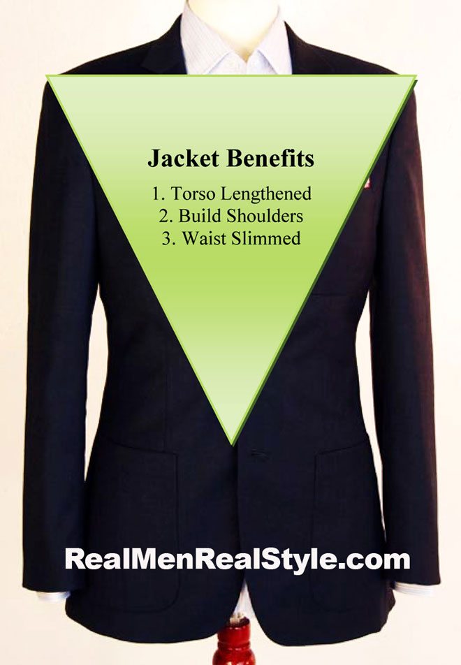
Centeno says that jackets improve their wearer's appearance in three ways: by bulking out the shoulders; by slimming the waist; and by drawing attention to the face and making the wearer seem taller.

The first of these benefits, the bulking effect, is obvious. The second, the apparent slimming, happens because jackets taper a bit above the waist, and widen above the taper, an effect accentuated by their outward-spreading lapels. And they flare out over the stomach and hips, hiding weight you may be carrying under the flare. So the middle of the jacket is narrowed, which "makes you look like our image of a healthy man: tucked at the waist, widening above it". As Centeno continues: "Think of it as a tummy tuck without the horrible, invasive surgery."

And the third benefit is also because jackets widen towards the top. This makes us naturally look from the waist up rather than the face down, making us think we're looking up at something even when we're taller than the wearer. This keeps people looking at your face rather than your middle. Centeno suggests asking people to guess your height with and without a jacket: the "with" guesses will always be greater.

Benefits of wearing a jacket, from Antonio Centeno's article.

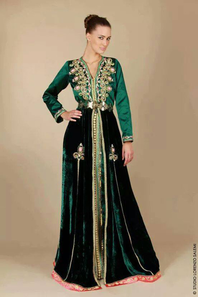
These effects work with the clothing of other cultures too. For example, the cross-shaped design on Moroccan shirts and dresses. Here are two examples that have got copied to many sites on the Web. They show how the "V" formed by the top of the design draws attention to the face:

Moroccan shirt. Owner of photo not known.
Moroccan dress or kaftan. Photo marked as by Studio Lorenzo Salemi.

So, going back to visual linguistics, one question about these visual "utterances" is: why are they so popular, and what has this to do with the way they enhance the wearer's perceived fitness?

Wednesday 13 January 2016

The Semantics of Line Drawings XIV, Grylloi and Visual Linguistics

[ The Semantics of Line Drawings XIII, Why is Reading so Easy? | The Semantics of Line Drawings XV, The Difference a Jacket Makes ]

In my last post, I referred to Mark Changizi's book The Vision Revolution and his online article "The Topography Of Language". In the latter, he says:

Amongst both non-linguistic and linguistic signs, some visual signs are representations of the world­ e.g., cave paintings and pictograms, respectively and it is, of course, not surprising that these visual signs look like nature. It would be surprising, however, to find that non-pictorial visual signs look, despite first appearances, like nature. Although writing began with pictograms, there have been so many mutations to writing over the millenia that if writing still looks like nature, it must be because this property has been selectively maintained.

Why has this property been maintained? Because the visual system could use its object-recognition software for reading writing that was shaped like nature. Writing that wasn't thus shaped would be harder to read, so fall out of use. This kind of answer, Changizi says, beongs to a new discipline, "visual linguistics":

Because culture is capable of designing for the eye, the visual signs of our culture are a fingerprint of what our visual systems like. Akin to the linguistic study of the auditory productions humans make, the “visual linguistic” study of the visual productions people make is a currently under-utilized tool for vision research.

In other words, visual linguistics studies our visual "utterances". The subject has hardly begun, which is why in this table from the chapter on reading in The Vision Revolution, the appropriate cell in the table below is marked with a question mark (and with a shaky font which I can't reproduce here):

Laboratory experimentsHuman "utterances"
CognitionCognitive psychology,
cognitive neuroscience
Linguistics
VisionVisual psychophysics?
Visual Linguistics

So here's another question for visual linguistics. Why are grylloi so popular? They're easy to draw, but maybe that's not the only reason. I suspect that to our visual system, they look much more like people than they "ought" to. The semantic distance between human and gryllos, one might say, is much less than the geometric distance.

"Scotch Egg" by me

Tuesday 12 January 2016

The Semantics of Line Drawings XIII, Why is Reading so Easy?

[ The Semantics of Line Drawings XII, Grylloi | The Semantics of Line Drawings XIV, Grylloi and Visual Linguistics ]

I'll return to grylloi, but I want to ask a question. Why is reading so easy? In a few seconds last night while updating this blog, I was able to read wikiHow's recipe for linking Blogger to Twitter. And therefore, as Mark Changizi puts it in his book The Vision Revolution, install new software in me. Amazon, he says, listed at least 720,000 "how-to" books when he was writing in 2009. Each is a piece of software just waiting to be implemented by a human brain. Recipes for gefilte fish; techniques for training your labrador to fetch; how to clean the dirt off the bottom of a swimming pool. All encoded as a sequence of little marks that impress themselves on our brain, automatically and without effort.

But what is it about letters and words that fits our visual system so well? Changizi's answer is that the geometrical properties of written words are similar to those of objects. Our brains have had to evolve to be very very good at recognising objects; if the brain can use the same part of the visual system for recognising words, it's bound to help it read them.

By "geometrical properties", Changizi means how often different kinds of junction occur in words. This, obviously, is a consequence of the kinds of junction in the symbols that make up the words. These symbols might be letters such as A or ҕ, syllabic characters such as those in ᓀᐦᐃᔭᐍᐏᐣ (the Plains Cree word for Plains Cree), logograms such as the Chinese 中文, and so on. A comprehensive list of writing systems can be found at Omniglot's "Index of languages by writing system". Look at these, and you'll see that, for example, Y junctions are common but ✱ junctions are rare. Somehow, all these symbols feel as though they come from the same family of shapes.

Why? Our visual system is organised in a hierarchy. At the top is recognition of complete objects. At the bottom is recognition of primitive features such as single edges or strokes. And in between are levels that recognise simple combinations of these primitives, such as the L, T, and Y junctions I've marked in my cartoon below:

"A4Billion" by me

In fact, most of the junctions in my drawing are L, T, and Y junctions. There are good geometrical reasons for this, to do with how objects meet and overlap, and how the places where they do look when projected down to two dimensions. This is explained in The Structures of Letters and Symbols throughout Human History Are Selected to Match Those Found in Objects in Natural Scenes by Mark Changizi, Qiong Zhang, Hao Ye, and Shinsuke Shimojo. (Search for "Other strong ecological relationships can be derived with the help of some defensible empirical assumptions concerning the relative probability of L, T, and X junctions").

So images of objects have a certain frequency distribution of junction types. It seems that written words might have a similar distribution. And indeed, Changizi and colleagues say they've shown that they do. For the frequency graphs, see Changizi's short write-up "The Topography Of Language". And that's why we're such excellent readers. Writing looks like natural scenes, which our visual systems are superbly evolved to recognise.

Monday 11 January 2016

The Semantics of Line Drawings XII, Grylloi

[ The Semantics of Line Drawings XI, Anthropomorphism | The Semantics of Line Drawings XIII, Why is Reading so Easy?]

I once read the following in John Adkins Richardson's The Complete Book of Cartooning:

The aggressor with the knife is nothing but a bodiless head with legs and arms sprouting directly from the chin and cheeks. Such figures are of very ancient origin and even have a name. They are grylli (gryllos for singular) and while there are more complicated and monstrous varieties passing under the same rubric, this version is the most typical. During the 1960s underground cartoonist Rich Griffin invented a particularly disquieting version of the gryllos, a disembodied eyeball on legs ..."

I don't have the book to hand, and I've pasted together the quote above from Google Books searches which won't let me look at the illustration Richardson was talking about. I remember it to be of a head on legs with, as he says, arms sprouting from its chin or cheeks. However, the name sounded Greek, so I was fairly sure that the plural should be "grylloi" and not "grylli". A search in Brill’s New Pauly confirmed this:

According to Pliny (HN 35,114), the name for caricature depictions in painting since Antiphilus [4] of Alexandria represented a certain Gryllus in that way. Originally these were dancers with grotesque physical proportions and contortions. As gryllographeîn and grylloeídēs later generally referred to ridiculously proportioned bodies, small-format free-standing sculpture representations can also be described as grylloi. Today the genre is no longer attributed to Alexandrian art only. To cover all animal caricatures and monstrous figures as well as the parodies of gods depicted in the wall painting of Pompeii with the term grylloi is dubious as well. On the other hand, the historical identification of ancient grylloi is increasingly replaced by cultural sociological interpretations of all kinds of representations of misshapen and absurd people ( Caricatures; realism as a means of expression).

Although "gryllos" may have denoted other kinds of distortion, I think that in cartooning, the head-with-arms-and-legs is so common that we do need a word for it. Which might as well be "gryllos". Grylloi are easy to draw, so there are huge numbers of examples. Basically, anything ball-shaped that the artist needs to make into a living being.

My first thought on looking for examples was haggis. And sure enough, an image search yielded lots. Those on all fours probably shouldn't count as grylloi, but as animals. However, this kilted figure, with its arms at a higher level than its mouth, definitely is a gryllos:

From a post by "M-J" on the Nissan Juke Owners Group

Sunday 10 January 2016

The Semantics of Line Drawings XI, Anthropomorphism

[ The Semantics of Line Drawings X, Recruitive versus Non-Recruitive Prosopification | The Semantics of Line Drawings XII, Grylloi]

My posting about "The Two Giants of the Time" demonstrates, of course, anthropomorphism. That is, adding arms and legs and other bits to an object in order to make it act as though it's human. Here's an anthropomorphic washstand:

Postage stamp, Moidodyr. From a strip of 5 postage stamps, "Tales". Russia. 1993. From Wikimedia Commons.

This is from a Russian story called Мойдодыр by Korney Chukovsky. It's about a naughty boy who gets so dirty that his clothes and other belongings flee from him. Moidodyr the washstand, "leader of washstands and commander of sponges" chases after the boy, backed up by soap and brushes; the chase continues all over Saint Petersburg as the boy is pursued by a furious sponge; and eventually, a sponge-eating crocodile intervenes and the boy goes home and gets cleaned up. There are many Moidodyrs: click on this image search to see more.

In advertising, an excellent compilation of anthropomorphic characters is Meet Mr. Product by Warren Dotz and Masud Husain. To meet them, click here.

Thursday 7 January 2016

The Semantics of Line Drawings X, Recruitive versus Non-Recruitive Prosopofication

[ The Semantics of Line Drawings IX, Prosopification | The Semantics of Line Drawings XI, Anthropomorphism]

Bill Peet, Disney's greatest story man for 27 years, is a master of what I call recruitive prosopofication. When adding faces to objects, he often uses lines already there. Here's a lovely example:

Of it, Peet says: "A drawing of an unhappy caboose rattling along under a cloud of train smoke was stuck on my studio wall for fifteen years before she became 'Katy' in the story 'The Caboose that got Loose'". Do a Google image search for the caboose who got loose, and you'll see many other drawings of the caboose in various attitudes. The line of its "mouth" is either shadow under the back door, or the top of the little platform. Peet often shades mouths very dark, as in some of these monsters. With the caboose, he's doing the same on the lines that have been recruited to represent a mouth. There are lots of nice examples in his book Bill Peet: An Autobigraphy.

Wednesday 6 January 2016

The Semantics of Line Drawings IX, Prosopofication

[ The Semantics of Line Drawings VIII, "The Two Giants of Our Time" | The Semantics of Line Drawings X, Recruitive versus Non-Recruitive Prosopofication]

Returning to transformations, we often see what I call "prosopofication", from the Modern Greek word for "face", το πρόσωπό. This transformation adds a face to an object that normally would not have one. It is extremely common in advertising and children's stories.

Here's a charming example. It's from a Russian book called Колобок, which tells the story of a little round bun which runs away from the house where it was baked, escapes a hare, a wolf and a bear, but is eaten by a fox. This is a fairy-tale, well-known in Russia and Ukraine (who seem to have been disputing each other's rights to it), and apparently in other East Slavic countries:

Tuesday 5 January 2016

The Semantics of Line Drawings VIII, "The Two Giants of the Time"

[ The Semantics of Line Drawings VII, Why Study Morphisms? | The Semantics of Line Drawings IX, Prosopification ]

Here's a poem from Punch Volume XXXIII, 1857. I'm going to use it as an example of something, but I found it striking and definitely worth a blog entry of its own. It's on the left of page 132, which I've shown below in its entirety, followed by a bigger copy of the picture at the top of the poem and the transcribed text. I bought the Punch in an Oxford market: checking online, I see that the Internet Archive has a copy.

.

THE TWO GIANTS OF THE TIME.


“WHAT can we two great Forces do?”
Said Steam to Electricity,
“To better the case of the human race,
And promote mankind’s felicity?”

Electricity said, “From far lands sped,
Through a wire, with a thought’s velocity,
What tidings I bear! — of deeds that were
ever passed yet for atrocity.”

“Both land and sea,” said Steam, “by me,
At the rate of a bird men fly over;
But the quicker they speed to kill and bleed,
A thought to lament and sigh over.”

“The world, you see.” Electricity
Remarked, “thus far is our debtor,
That it faster goes; but, goodness knows,
It doesn’t get on much better.”

“Well, well,” said Steam, with whistle and scream,
“Herein we help morality;
That means we make to overtake
Rebellion and rascality.”

“Sure enough, that’s true, and so we do,”
Electricity responded.
“Through us have been caught, and to justice brought,
Many scoundrels who had absconded.”

Said Steam, “I hope we shall get the rope
round the necks of the Sepoy savages,
In double quick time, to avenge their crime,
And arrest their murders and ravages.”

“We’ve been overpraised,” said both; “we raised
Too sanguine expectations:
But with all our might, we haven’t yet quite
Regenerated the nations.

“We’re afraid we shan't — we suspect we can’t
Cause people to change their courses;
Locomotive powers alone are ours:
But the world wants motive forces.”

Monday 4 January 2016

The Semantics of Line Drawings VII, Why Study Morphisms?

[ The Semantics of Line Drawings VI, Inflating Significant Zones | The Semantics of Line Drawings VIII, "The Two Giants of the Time" ]

When talking about transformations, mathematicians often use the word "morphism". The word has a precise meaning in the branch of mathematics known as category theory, and a somewhat vaguer meaning elsewhere. In general, though, it's associated with the idea that when you study how one thing can be transformed into another thing, you should be particularly interested in transformations that preserve "structure".

A simple example is modular arithmetic. Take the addition table for the non-negative integers, and make from it another table where the addition "wraps round" whenever the answer is greater than a specific integer N. When N is 12, we have the familiar clockface arithmetic, where 11+1=0, and 11+2=1, and 5+7=0, and 5+8=1, and so on. The resulting addition table is wildly different from normal addition: for a start, it's finite. But it does have properties in common. For example, 0 is still special in that it does nothing when added. If we make a clockface-multiplication table, in which 2*6=0, and 3*4=0, and 3*5=3, and so on, then 0 is special there too, because multiplying by it still always gives 0. And so is 1 special: multiplying a number by it still gives that number. So making the clockface-arithmetic tables preserves the special rôles of 0 and 1. These are a vital part of the structure of the integers.

Outside mathematics, lots of examples occur in jokes. For example:

An American and a Russian were discussing politics. The American said "In our country, we have freedom of speech. You can stand in front of the White House and yell, 'Down with Reagan!', and you will never be punished." The Russian said "So what? I can stand in Red Square and yell, 'Down with Reagan!', and I will not be punished."
In that joke, the White House and Red Square are like the 0 and the 1. They're a special part of the structure of the countries: distinguished elements which map onto one another. Reagan is another such element: the joke is that the corresponding element of Russia should be Gorbachev, so the transformation from America to Russia has violated the structure. In Metamagical Themas, Hofstadter has lots of examples (humorous and non-humorous) in the essays "Metafont, Metamathematics and Metaphysics", "Analogies and Roles in Human and Machine Thinking", and "Variations on a Theme as the Crux of Creativity". In the last, Hofstadter's "counterfactuals" are the transformations, and he's discussing whether they violate structure by "slipping" elements too far.

On rereading this, I notice that I seem to be implying that "structure" is about the distinguished parts that an entity has, and how those parts are preserved when it's transformed to another entity. But I don't think that's the entire story. For example, topologists study "structure-preserving" transformations between spaces, but many of those spaces don't have distinguished parts. Anyway, I hope the above gives an intuitive idea of what "structure" is. But as Michael Greinecker notes in his Stack Exchange answer to the question "Why do we look at morphisms?", it is hard to say what mathematicians do mean when they talk about structure. Neverthelsss, he has nicely answered the question I posed in my title, so that's where I'll stop today.

Sunday 3 January 2016

The Semantics of Line Drawings VI, Inflating Significant Zones

[ The Semantics of Line Drawings V, Helveticality Descending into the Darkness | The Semantics of Line Drawings VII, Why Study Morphisms? ]

When I started this series, I said that I wanted to find out what kinds of transformation can be applied to line drawings, and what their properties are. I've mentioned one, the texture-deleting one that I call "appointing a representative". Another, the topic of this posting, enhances crucial regions relative to the rest of the drawing. By "crucial regions", I mean those regions that are most important for recognising what the drawing depicts. Every cartoonist who has had to draw the same character at wildly different sizes will, I think, be familiar with this. But for an excellent example and explanation, please read my previous post and Hofstadter's explanation therein of how he renders Helvetica on smaller and smaller grids. The key point there is:

The second and third columns are the work of an algorithm that has information about zones likely to be characteristic and critical for recognizability. It mathematically transforms the original outline so that the critical zones are disproportionately enlarged (the way your nose is enlarged when you look at yourself in a spoon). It then applies the naive algorithm to this new outline (pixels light up if and only if they fall inside). This amounts to an interesting trade-off: sensitivity in the critical zones is enhanced al the sacrifice of sensitivity in less critical zones.

Saturday 2 January 2016

The Semantics of Line Drawings V, Helveticality Dissipating into the Darkness

[ The Semantics of Line Drawings IV, Douglas Hofstadter's Metaphor for Translation | The Semantics of Line Drawings VI, Inflating Significant Zones ]

In my last posting, I showed an image of stepping stones in a stream, Douglas Hofstadter's metaphor for translation. One specific case of this is: what if you're translating from a language into the same language, but with a coarser resolution? For example, if you're trying to précis a novel, or squeeze the gist of a newspaper article into its lead paragraph, or display an image at very low resolution. This is one of the themes in the essay that I referred to last time, Douglas Hofstadter's "Analogies and Roles in Human and Machine Thinking". It's a special case of his Letter Spirit project, which explores the mechanisms that high-level cognition might use to design stylistically consistent fonts on fairly simple grids. For examples, search for the section heading "Some sample gridfonts" in the linked page.

Investigating creativity and style in font design is like investigating Newton's laws using inclined planes and balls: it provides an easy-to-control microdomain from which irrelevant influences are easily excluded. Hofstadter's image and commentary below — from page 597 of the PDF — are set within the same microdomain, and make a nice example of something I want to refer to in my next post:

FIGURE 24-12. Helveticality emerging from the gloom. Proceeding from bottom to top, we have a series of increasingly fine-grained dot matrices within which to maneuver. Clearly, both the 'a'-ness and the Helveticality get easier and easier to recognize as you ascend — especially if you look at the page from a few feet away. Proceeding from left to right, we have a series of increasingly letter-savvy programs doing the choosing of the pixels to light up. (As a matter of fact, the rightmost column is a very light touch-up job of the third column, done by a human.)

The leftmost column is done by a totally letter-naive program. It takes the curvilinear outline of the target shape and turns on all pixels whose centers fall within that outline.

The second and third columns are the work of an algorithm that has information about zones likely to be characteristic and critical for recognizability. It mathematically transforms the original outline so that the critical zones are disproportionately enlarged (the way your nose is enlarged when you look at yourself in a spoon). It then applies the naive algorithm to this new outline (pixels light up if and only if they fall inside). This amounts to an interesting trade-off: sensitivity in the critical zones is enhanced al the sacrifice of sensitivity in less critical zones. Consequently, some pixels are turned on that do not fall inside the letter's true outline, while some that do fall inside that outline remain off It's a gamble that usually pays off but not always, as you can see by comparing the first and second letters in, say, the third row.

The difference between the second and third columns is that in the second column, the critical zones are crude averages fed to the program and don't even depend on the letter involved. In the third column, however, the program inspects the curvilinear shape and determines the zones itself according to its knowledge of standard letter features such as crossbars, bowls, posts, and so on. Then it uses these carefully worked-out zones just the way the second algorithm uses its cruder zones: by distorting the true outline to emphasize those zones, and then applying the naive algorithm to the new outline.

But no matter how smart a program you are, the problem gets harder and harder as you descend towards typographical hell — matrices too coarse to capture essential distinctions. En route to hell, more and more sacrifices are made. Helveticality goes overboard first, then 'a'-ness; and from then on, entropy reigns supreme. But just before that point is the ultimate challenge — and only people can handle it, so far. [Computer graphics by Phill Apley and Rick Bryan.]

Friday 1 January 2016

The Semantics of Line Drawings IV, Douglas Hofstadter's Metaphor for Translation

[ The Semantics of Line Drawings III, Appointing a Representative | The Semantics of Line Drawings V, Helveticality Dissipating into the Darkness ]

Here's a lovely metaphor for translation, from Douglas Hofstadter's essay "Analogies and Roles in Human and Machine Thinking" in his book Metamagical Themas. In the PDF, it's on page 588. I'm posting it here because I'll need it in future posts.
FIGURE 24-7. A metaphor for translation. A stream (symbolizing reality) has two sets of stepping-stones (symbolizing the basic ingredients of a language, such as words and stock phrases) in it. The black stones (Burmese, say) are arranged in one way, and the white stones (say, Welsh) in some other way. A pathway linking up a few black stones (a thought expressed in Burmese) is to be imitated by a "similar" pathway joining up white stones (translated into Welsh). One possibility is the speckled pathway, located at nearly the same part of the stream as the original pathway but not terribly similar in shape to it (a fairly literal translation), while a rival candidate (a more literary translation, needless to say) is the pathway located a distance upstream and resembling the original in some more abstract ways, including patterns in some of the "overstones" of the main stones (the similar archipelagos in Burmese and Welsh stones running roughly parallel to the far bank).