[ The Semantics of Line Drawings IV, Douglas Hofstadter's Metaphor for Translation | The Semantics of Line Drawings VI, Inflating Significant Zones ]
In my last posting, I showed an image of stepping stones in a stream, Douglas Hofstadter's metaphor for translation. One specific case of this is: what if you're translating from a language into the same language, but with a coarser resolution? For example, if you're trying to précis a novel, or squeeze the gist of a newspaper article into its lead paragraph, or display an image at very low resolution. This is one of the themes in the essay that I referred to last time, Douglas Hofstadter's "Analogies and Roles in Human and Machine Thinking". It's a special case of his Letter Spirit project, which explores the mechanisms that high-level cognition might use to design stylistically consistent fonts on fairly simple grids. For examples, search for the section heading "Some sample gridfonts" in the linked page.
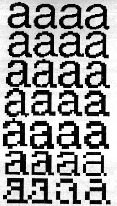
Investigating creativity and style in font design is like investigating Newton's laws using inclined planes and balls: it provides an easy-to-control microdomain from which irrelevant influences are easily excluded. Hofstadter's image and commentary below — from page 597 of the PDF — are set within the same microdomain, and make a nice example of something I want to refer to in my next post:

FIGURE 24-12. Helveticality emerging from the gloom. Proceeding from bottom to top, we have a series of increasingly fine-grained dot matrices within which to maneuver. Clearly, both the 'a'-ness and the Helveticality get easier and easier to recognize as you ascend — especially if you look at the page from a few feet away. Proceeding from left to right, we have a series of increasingly letter-savvy programs doing the choosing of the pixels to light up. (As a matter of fact, the rightmost column is a very light touch-up job of the third column, done by a human.)
The leftmost column is done by a totally letter-naive program. It takes the curvilinear outline of the target shape and turns on all pixels whose centers fall within that outline.
The second and third columns are the work of an algorithm that has information about zones likely to be characteristic and critical for recognizability. It mathematically transforms the original outline so that the critical zones are disproportionately enlarged (the way your nose is enlarged when you look at yourself in a spoon). It then applies the naive algorithm to this new outline (pixels light up if and only if they fall inside). This amounts to an interesting trade-off: sensitivity in the critical zones is enhanced al the sacrifice of sensitivity in less critical zones. Consequently, some pixels are turned on that do not fall inside the letter's true outline, while some that do fall inside that outline remain off It's a gamble that usually pays off but not always, as you can see by comparing the first and second letters in, say, the third row.
The difference between the second and third columns is that in the second column, the critical zones are crude averages fed to the program and don't even depend on the letter involved. In the third column, however, the program inspects the curvilinear shape and determines the zones itself according to its knowledge of standard letter features such as crossbars, bowls, posts, and so on. Then it uses these carefully worked-out zones just the way the second algorithm uses its cruder zones: by distorting the true outline to emphasize those zones, and then applying the naive algorithm to the new outline.
But no matter how smart a program you are, the problem gets harder and harder as you descend towards typographical hell — matrices too coarse to capture essential distinctions. En route to hell, more and more sacrifices are made. Helveticality goes overboard first, then 'a'-ness; and from then on, entropy reigns supreme. But just before that point is the ultimate challenge — and only people can handle it, so far. [Computer graphics by Phill Apley and Rick Bryan.]
No comments:
Post a Comment