Thursday, 3 September 2015

The Semantics of Line Drawings III, Appointing a Representative

[ The Semantics of Line Drawings II, Information Deformation Theory | The Semantics of Line Drawings IV, Douglas Hofstadter's Metaphor for Translation ]

Here's a not very good picture taken from my bedroom window:

You can see that the walls of the houses are brick, and just about see the individual bricks. Suppose that you wanted to draw this in black and white. Drawing all the lines between the bricks would make the drawing look "busy", as would shading each brick to indicate its tonal value. So if you want to indicate that there are bricks in the wall, what do you do? One possibility is to apply a transformation that I call "appointing a representative".

You draw just a few patches of bricks, leaving the viewer's brain to fill in the rest. These patches are representatives for the rest of the bricks.

This transformation can be thought of as a two-step process. In the first step, draw all the bricks. Unfortunately, this overemphasises them relative to the rest of the drawing. So in the second, reduce the "brick level" until they are no more prominent than in the photo.

The Semantics of Line Drawings II, Information Deformation Theory

[ The Semantics of Line Drawings I | The Semantics of Line Drawings III, Appointing a Representative ]

An interesting aspect of the semantics of line drawings is what one might call Information Deformation Theory. Here's an example.

I was drawing people's hands from across Cornmarket Street, a wide shopping street in the centre of Oxford. From one side of Cornmarket, you can see the general shape of the hands of people on the other side, and the positions of some of the fingers if the light is favourable. My natural tendency is to try to draw all the fingers, with lines indicating the boundary of each. But this looks very wrong. Why?

It looks wrong, I think, for the same reason that I mentioned in one of the slides for my Thales talk: "Texture lines are often omitted". The slide showed a drawing from Christopher Hart's book How to Draw Cartoon Baby Animals. When drawing the face, Hart advises, draw ruffles of fur on the cheeks, but leave a large neutral space under the chin. This allows the eye to "rest" and stops the animal from looking too furry.

Similarly, cartoonists often draw only a few isolated patches of bricks in walls, as in this clip-art Great Wall of China:

Drawing the spaces between bricks or blocks as black lines overemphasises them relative to the original scene. And in my drawings of hands, drawing all the boundaries between fingers, even with a fineliner pen, would overemphasise them.

In other words, the medium — such as pen and ink — biases the information represented with it, and the artist must compensate by warping or deforming the drawing in some way. That's what I propose to write about in the next few posts.

Sunday, 26 July 2015

Enhancing the Moment vs. Enhancing the Image Bank

When I used to go to the Caption Comics Festival, before the committee decided not to hold it in Oxford any more, one of the artists I enjoyed chatting with was Bib Edwards. Bib has passed away, but I still value his advice. He told me that to help me draw from imagination, I should sketch whenever I could, drawing everything I had the chance to. After four years, he said, I would have built up a reasonably sized image bank. And when I drew from imagination, I would subconsciously find myself using bits and pieces of the images from it.

This is a different use of memory from trying to remember a specific person (say) so that you can sketch them before they move away. I'm writing this partly to make that distinction. But I hope that psychology and neuroscience can help artists both enhance the moment and enhance their image banks.

While drawing from imagination is fun, it's more fun when you don't have to keep stopping to look up reference pictures for difficult poses, pieces of machinery, costumes. And, it's more fun when you don't have to stop and spend all day working it out. To see what I mean, consider people's arms. When you're drawing a cartoon, you can get away with drawing arms as tubes standing distinct from the body. I did that below, and the result is perfectly intelligible:

But now look at the real-life arms in this Wikipedia photo of a jersey:

The arm on the right is very slightly obscured by a fold of fabric from the jersey. Because of the bagging of the jersey, the one on the left has a characteristic double-curved dark line bounding the upper arm. When drawing more realistically, and indeed, even when drawing cartoons, it's good to be able to add such details. They inform about shape and pose, and they satisfy the brain, preventing the drawing from looking too schematic.

You can force such details into your brain through practice, practice, and more practice. And if that's the only way, that's what the artist must do. But it would be silly not to ask whether neuroscience can make the uptake of such information easier. For example, there's the phenomenon of flashbulb memory, whereby everyone remembers where they were when Princess Diana died. Surprise, importance, and emotion, it seems, make memories more vivid and less fragile. So could we hook into the flashbulb-memory mechanism in order to strengthen the memories to be added to the image bank? Perhaps by viewing the images to be recorded through smart glasses, and changing their colour or making them very bright. Perhaps chemically, by stimulating the "downstream" production of whichever neurotransmitters strengthen memory storage, if indeed that's how flashbulb memory works.

Or perhaps most of us already have such memories, and the problem is not storage but retrieval. That's hinted at by Allan Snyder's experiments on trans-cranial magnetic stimulation. A related question, though one which may apply to enhancing the moment only: does the brain contain an analogue map of the visual field? If so, is there any way to make it accessible so that one can draw directly from it? This would eliminate a lot of tedious angle- and proportion-judging.

One subgoal of such research should be to help artists consciously "see" the components of their image banks, so that they can mentally compose them, in full three-dimensional Technicolor glory.

Training Visualisation via Afterimages

There are several discussions on the Web about improving visual imagination and memory. I wrote about one of them in an earlier posting, "From 'I cannot mentally visualise' to 'god what a taste of fire'". The second part of that title comes from a comment by user "fritillary" who, explaining how she had revolutionised her own visualisation abilities, remarked:

It was months before I saw any results, but god what a taste of fire.
Another discussion that I've just found on lesswrong.com suggests a way to do this — namely, using afterimages. Actually, it's concerned with auditory "afterimages", but would it also work for visual memory?

The discussion is in a thread called "generalizing From One Example". (In case the site should disappear, I've archived this in the Wayback Machine.) The title refers to the "Typical Mind Fallacy", the belief that one's own mind is similar to everyone else's. According to user Yvain who started the thread, Francis Galton carried out a study on mental imagery, presumably the one written up in "Statistics of Mental Imagery", Mind, 5 (1880). Galton gave people detailed questionnaires about how well they could visualise. Some subjects couldn't form mental images at all, others had almost perfect imagery. But the ones who did assumed everyone did, and the ones who didn't assumed no-one did, to the point of supposing that anybody claiming they could image was lying. Thus Galton experienced the Typical Mind Fallacy. Most of the rest of the thread concerns applications of the Fallacy, including visualisation. The contributions that interest me today are by user "cousin_it", in this comment and this (archived here and here).

In the first comment, cousin_it wrote:

Regarding differences in mental imagery: only this winter did I really understand that good musicians have vivid aural imagination, while I couldn't hear any sounds in my head, period. Immediately after this realization I started exercising. By now I can hear complete monophonic melodies, and (on good days) imagine two notes sounding at the same time. Classically trained conductors can imagine a complete orchestral sound while reading sheet music. I don't see any reason why visual imagination can't be similarly trained.
Another user then asked how cousin_it practised this skill. Here's the reply:
The hardest part for me was the beginning, getting a toehold at any inner sound. Pick a note on the guitar - I started with D on the second string. Play it at a steady rhythm with rests, slowly fading away into nothing. (Might not be possible on the piano or other instruments.) At some moment the brain will start to "complete" the sound, even though by that point you're playing too softly to hear. Catch that feeling, expand on it. When you can "do" several different notes, try playing a simple melody and hearing it afterwards. After you're comfortable with that, try to hear a simple major scale without playing it immediately beforehand. Then work from unfamiliar sheet music without playing it - solfege-sing in your mind - by now I can do this quite easily. And so on.

One thing to investigate, I think, should be what happens in the brains of people who have learned to "complete". Does some part of the brain's state when hearing the sound persist once that sound is gone? Is there some kind of feedback that is keeping this going? Does the brain state of completers differ from that of people who have not learned to complete?

As far as applying the idea to vision goes, we need an analogue to fading notes. The obvious thing to try is fading simple shapes — perhaps lines or circles — on a computer screen. It would be a fairly simple research project to write suitable software and try it out on a range of subjects.

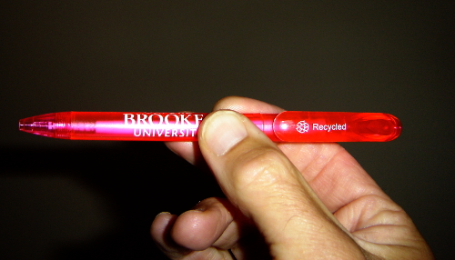
Not having such software, I looked around for an object I could try "fading". The pen pictured below (*) seemed a good choice:

It's in a translucent violently-magenta case, vivid enough to grab the attention, especially if direct light is shining through. It's actually quite a lot brighter than in the photo, as if softly glowing. I tried holding it horizontal in the middle of my visual field, then snatching it rapidly away along its own length while concentrating on retaining the image, doing this twenty times. I seemed to be able to maintain an afterimage for a short time, provided that I viewed the pen against a white background with no distractions, namely my ceiling. Is this worth practising? Of course, one has to beware of the N-ray effect.

By the way, I came across one advocate of afterimages for visualisation. It's Marko Martelli on his self-help site unchainmybrain.com . In his "How to Develop the Ability to Visualize Mental Imagery – From Scratch" (archived here), Marko suggests looking at a candle flame for ten to twenty seconds, then closing your eyes and trying to keep the afterimage for as long as possible. Describe the flame's colour, shape and other properties to yourself in words as fully as possible. Then open your eyes and repeat the exercise, for no more than five minutes. Practise regularly, Marko says, and you will see progress. Marko says that he developed this method after long practice, frustrated at not being able to visualise.

(*) Coincidentally, the pen was given to me at a discussion with Brookes University about applying sports science to drawing. But that's another topic.

Friday, 3 July 2015

The Semantics of Line Drawings I

[ The Semantics of Line Drawings II, Information Deformation Theory ]

I've just given a talk in Athens. Only virtually, unfortunately, because I do love the city. I spoke on The Semantics of Line Drawings. What are the different uses to which artists put lines? What kinds of information do they convey? And how can we express this information mathematically? We'll need to do that if we are to make computers draw and understand drawings.

I'd been invited by Project Thales: a group researching into the algebraic modelling of topological and computational structures. I've previously worked in this field in a very different context, that of making spreadsheets modular. But, these mathematical methods can be applied to a huge variety of different problems. One of these could be described, very generally, as the problem of how to integrate different points of view. For example, in urban design, how can you reconcile the very different vocabularies and modelling methods used by, for example, a transport planner, an expert on making streets safe from crime, and a designer who wants to minimise energy loss in houses? This is something that I and a colleague will be writing up later. I mention it here because it is, like the topic of this posting, an "art" problem. Algebraic modelling is very definitely applicable to art.

So let's get back to semantics: the way that languages convey meaning. For programming languages, and other artificial languages such as those used to describe integrated-circuit designs, this is vital for ensuring that your programs and machines do what they were intended to. Rather important for nuclear reactors and Google's driverless car, but not unimportant even for mobile phones, supermarket U-scans, and banks. (One might argue that the recession of 2008 could have been avoided had we had a decent semantics of bankers.)

The semantics of natural languages is more complicated, but needed for speech understanding, automatic translation, and searching. My interest in this is that there's a sense in which drawing is a language too. In some drawings, this may seem obvious. Some of the lines in a line drawing have a clear geometric interpretation — they denote the edges and "rims" of objects, namely the places where the line of sight grazes the object's surface. When projected onto the image, they form a silhouette. We now understand very well how to convert these lines back into a 3-D model: see the references I gave in this slide. So the meaning of these lines is clear.

But lines are used in many other ways. What are they, and can we formalise them?

Most people understand line drawings easily, and realise, for example, that the cross-hatched lines in the school-story picture below are not to be interpreted as lines, but as shadow:

Similarly, note the horizontal lines on the back of the leftmost animal below, and the vertical ones on the nose of the rightmost. These don't represent scars or other marks, but tell us about the orientation of their surfaces:

And in this drawing by Wilhelm Busch, the lines rising from the bathtub represent steam, even though steam does not have a definite boundary:

Here's another Busch drawing, from the well-known Max und Moritz strip in which two naughty boys torment the bourgeois townsfolk and eventually meet their doom in a baker's milling machine. In the picture, they have fallen into his dough:

I find those lines characterful, conveying a droopy, gloopy, effect. Not drippy: drooping is slower than dripping, with bigger drops. Which brings us on to cross-sensory association, the bouba/kiki effect, and asssociations such as those Paul Klee writes about in his Pedagogical Sketchbook. As you can see, I'm moving from the physical attributes that lines denote (object boundaries, light and shade, orientation, texture) to character, emotion, and mood.

I gave some examples of conveying these through line quality near the end of my talk, using excerpts from Leonard Doust's book A Manual on Caricature and Cartoon Drawing. The point is that artists do use such effects, so a semantics of line drawing must be able to handle them. One example is the drawing below:

Of the righthand figure, Doust says,

Please remember that it is not enough just to make a pattern or design. It must be in harmony in line and (or) tone with the character. This is, I think, patently obvious in Fig. 5. Surely a pun is not out of place when I say that here is a blockhead made of blocks. No imaginative sweeps nor complicated whirls as in Fig. 4, just plain solid chunks; and the whole, also a plain stolid design — heavy, with a sphinx-like stillness resulting perchance from extreme emptiness instead of, as in the Sphinx, extreme understanding.

A more extreme example is this one:

In a sense, this is as extreme as you can get, because it contains no recognisable objects whatsoever. The first design, Doust says, represents Speed. The second is Peace, and the third Intelligence. Whether or not you agree with him (I do), such drawings exist, so a formal semantics of drawing must be able to describe their meaning. How? I've hinted at that in my conclusion, and I'll write it up in a future posting.

(The first image is from The Greyfriars Holiday Annual, 1926. The second is from Lupo Alberto Collezione N. 7, 1993. The third and fourth are from Wilhelm Busch's Die schönsten Bildergeschichten für die Jugend, a 1960 edition presumably reprinted from Busch's late 19th century original. The fifth and sixth are from L. A. Doust's A Manual on Caricature and Cartoon Drawing, 1936.)

Monday, 22 June 2015

The Artist's Spex

I've been thinking about what could be done with mediated-reality glasses, i.e. ones that can edit your view of the world before you see it. As it happens, there are researchers developing what sound like some very suitable glasses very near me: in the Nuffield Department of Clinical Neurosciences, where Dr Stephen Hicks and his team have set up the Oxford Smart Specs Research Group.

Smart Specs use clever image processing to help people with very bad sight see better, as shown in the group of four images near the top of the Smart Specs page. The first image shows a lecture room in natural colour, with a view of some chairs and two men in the foreground, and a cupboard and door in the background. The following three images have been processed into monochrome, and show only the chairs and two men. Details have been thrown away, and contrast enhanced, making chairs and men much easier to see.

From an artistic point of view, the third image is the most interesting. It shows a very clear edge-detected image of one of the men, simplified so that only his hair, glasses, eyes, nostrils, mouth, chin-tip, T-shirt and trousers, and arms and hands (half in pockets) are visible. If you had a pair of Smart Specs and you wanted to cheat at urban sketching, you could do so very effectively by using the same algorithm to capture and render your subject in line.

But let's assume that you want to do the drawing yourself, rather than letting the computer do it for you. (Though perhaps, with kit such as this, as well as programs like the one Michael Haller, Florian Landerl, and Mark Billinghurst describe in "A Loose and Sketchy Approach in a Mediated Reality Environment", sketching will one day be as dead as John Henry's steel-driving.) How could Smart Specs help you learn to draw better? Here are some possibilities.

  • Highlight regions of negative space. This is the space between objects. As I've mentioned in this blog already, paying attention to this space, rather than to the objects themselves, fools the brain into drawing more accurately. See, for example, Brad Kasten's "Once you master negative space drawing it will forever change the way you see the world" page. But you need to learn to "see" negative space, and a tool to point out instances in real scenes would be very helpful.

  • Superimpose basic shapes. Here, you break objects down into simple two-dimensional shapes such as triangles and rectangles, and use these to create a framework for your drawing. There are some examples here at Bob and Phil's "Learn to Draw Whatever You Want" page. Once again, a tool that demonstrates instances in real scenes would be useful.

    The image processing would be harder than for negative space, because the former is an objective notion, whereas decomposition into basic shapes is subjective. You can argue about how much the body of a bird, say, must deviate from a triangle before it stops being useful to see it as one. But by inducing from example decompositions drawn by artists, it should be possible to define a best-match criterion.

Both negative space and basic shapes are techniques for seeing more accurately. So are the suggestions below, but in a rather different way. I don't think I'd call them "techniques" now: they're more like tools that could be applied either to the scene you're currently drawing, or to lots and lots of scenes that you can learn relationships from.

  • Superimpose a rectangular grid, to help you judge angles and lengths. This can also be useful in composing a drawing, as explained in Russell Stutler's "Page 11. How to Sketch" page.

  • Superimpose a horizontal rectangular grid, receding into the background, onto surfaces such as pavements and floors. This would provide a baseline for people's feet, and also show how distances parallel to the picture plane relate to distances perpendicular to it.

  • Superimpse ellipses onto clockfaces, wheels, the tops of cups, to show how to draw circles in perspective.

  • Superimpose plausible skull, skeleton, and muscles onto people and animals, to help understand their anatomy.

    This would require much much much more processing than the suggestions above, and I don't know whether it's feasible yet. But there certainly is work going on, as I found from Michael J. Black's presentation "Inferring 3D People from 2D Images".

  • Label different types of crease in clothes. Creases are important in drawing clothes accurately. But also, even in an abbreviated way in cartoons, they're useful for giving information about people's poses. For example, is part of the sleeve round an arm stretched or not, and what direction do the creases show the arm to be pointing in. There are several different kinds of crease — see 'Types of Folds An Illustrated Tutorial from "Drawing People: How to Portray the Clothed Figure"' by Barbara Bradley — and it's important to use the right type for the situation. So it would be useful to have a tool that classifies creases in real-life scenes.

Now here's a different type of suggestion again. Not for seeing more accurately, but for "seeing as".

  • Render reality in a particular style, in order to improve the translation from scene to style. Most lines in a line drawing don't exist in the scene, but have been introduced by the artist according to some set of conventions. In an analogue to sight-reading music, can you learn to look at a scene and "see" it in a particular artistic style? Russell Stutler suggests in "Page 11. How to Sketch" (under "Visualize the sketch on paper") that you can, and I've suggested a possible method here. You could do this on an ordinary computer, but running the rendering program on Smart Specs would enable users to immerse themselves in the results, perhaps making them much more effective.

And finally, here's one that would help with practising particular objects. When I'm in the street and I've just drawn a hand in a particular position, say, I often wish I could try drawing a slight variant. Not an hour or two later, when I can get back to reference books or computer, but immediately in order to help consolidate the original. So it would be great to have a program that can:

  • See what I've just drawn, search Google's image bank for photos of variants, and display them in front of my eyes for me to practise on.

Monday, 1 June 2015

The Body as Regions in a Memory Palace

I've been trying a new memory method for fast sketching of people. I mentally divide their image into regions, and superimpose a number on each, trying to note the outline of the region and the most important lines in it. Then I walk through the regions in order, recalling the shape and contents of each.

Three things inspired this. The first was some passages in Joshua Foer's book Moonwalking with Einstein, in which he looks at the techniques that Ben Pridmore and other memorisation champions use to memorise such remarkable quantities of information. In Chapter Five, "The Memory Palace", Foer notes that the point of memory techniques is to transform the information we want to remember into a form that our brains were built for. And apparently, one of these is navigation. Foer quotes the Memory Grand Master Ed Cooke:

"The thing to understand, Josh, is that humans are very, very good at remembering spaces," Ed remarked from his perch on the boulder. "Just to give an example, if you are left alone for five minutes in someone else's house you've never visited before, and you're feeling energetic and nosy, think about how much of that house could be fixed in your memory in that brief period. You'd be able to learn not just where all the different rooms are and how they connect with each other, but their dimensions and decoration, the arrangement of their contents, and where the windows are. Without really noticing it, you'd remember the whereabouts of hundreds of objects and all sorts of dimensions that you wouldn't even notice yourself noticing. If you actually add up all that information, it's like the equivalent of a short novel. But we don't ever register that as being a memory achievement. Humans just gobble up spatial information."

This made me wonder whether I could improve my memory for the things I was drawing by thinking of them not as single and relatively small objects, but as landscapes that I wanted to navigate.

My second source of inspiration was the Oxford Centre for Human Brain Activity research on attention and memory that I blogged in "Attention restores forgotten items to visual short-term memory". As I mentioned in that posting, the research suggested to me that when sketching someone who I've only seen briefly, then about a second after seeing them, I should deliberately scan my remembered visual field. And I should pay attention to those places in it where I think the most salient details for my drawing are. The division into numbered regions that I'm writing about today prepares for that scan, and the numbers make sure that I scan everything.

The final inspiration was the idea of a memory palace. It's the main memorisation technique that Foer writes about, but was known long before him, dating at least as far back as the ancient Greeks and Romans. The idea is to first build a mental image of a palace or other building. Then become so thoroughly familiar with it that you can reliably walk through it, guaranteeing to visit all its rooms or landmarks in a fixed sequence without missing any. Once you've done this, your memory palace is ready for use. To memorise a list of items, mentally place one item in each room. There are lots of techniques for converting hard-to-visualise items such as abstract concepts into images that are easier to visualise, and for associating them with the room they're in. To recall a list, just walk through the palace and see what's in each room.

Here's a sketch made using the method described in my first paragraph. I think it worked well, given that I drew it entirely from memory, something I don't think I could have done otherwise.

It's a man who I was watching from inside Combibos, standing near a Saturday market stall being set up in Gloucester Green. I haven't kept a note of how many numbers I superimposed, but it would have been around eight. Two went on his head: one for the quiff, and one for the rest of his hair. One was for his face and neck, including prominent eyebrows and the different length sides of the V below the neck, plus the change in direction of the collar further up. One was for his further arm, and one for the torso and nearer arm: the amount of visible back to the right of his arm was important, and I may have used negative space to judge this. And probably two regions were for his legs, with special attention paid to position of feet and to the stretch creases along his nearer leg. To make the perspective right, the bottom of the nearer trouser leg should probably have been lower.

Granted, the drawing looks stiff. This is partly because I was being quite deliberate when I drew the lines, not thinking about how to change their character to reflect what I was drawing. So the man's hair was drawn with the same simple straight line as his sleeves and trouser legs, even though one would have had a fine texture, one would have been gently undulating, and one would (if denim, which statistically speaking, it probably was) have been full of inelegant wrinkles and bulges. My memory didn't extend to that level of detail.

In drawing this and other sketches, I was thinking almost entirely about numbered regions. Even though the idea was inspired partly by Foer's passage about landmarks and navigation, I wasn't changing mental contexts to think of this as navigation. Would that have helped?

I haven't objectively tested this memory technique, so although it seems to work, that could be self-delusion. If it does work, it needs practice. Part of that, I've found, is being able to superimpose a constellation of numbers in parallel, because there isn't always time to work through them one by one. I think it also needs some prior experience in drawing, so that you know which features of the subject will be most useful in helping the viewer "read" your sketch, and hence should be paid attention to.

Tuesday, 6 January 2015

Stripping Away Meaning

Last August, I discussed the contents of my post "Can Psychology Help Us Draw?" with Glyn Humphreys, head of the Department of Experimental Psychology at Oxford. We talked about the way that certain techniques help the artist to concentrate on the shape of an object, ignoring what they "know" it should look like. Glyn called this "stripping away meaning". It's a good phrase, and I suggest that it should be adopted.

Here are the techniques for stripping away meaning that I mentioned in that post:

Negative space. This refers to the space around and between objects. Many artists train themselves concentrate on this space so that they can see the shapes of the objects inside it more accurately. Here are some short articles about it: "Figure/Ground Relationship" by Alice Taylor; "See Like an Artist: negative space" by Jay Alders; "art stuff - negative space and the left brain" by Kathy Hebert; and "Hand Drawing Demo #6: Reviewing Left Brain/Right Brain" by Anne Bobroff-Hajal.

Inversion. There are drawing exercises in which one copies inverted images in order to focus attention on shape. Here are two typical articles about this: "Upside down Drawing and Contour Drawing" by "Davy"; and "Day #031 - Drawing Picasso’s Igor Stravinsky Upside Down" by "Neelima". It occurred to me that psychologists have used inverting spectacles in experiments on the adaptability of vision. Could they help us draw? It should be possible to program image inversion into Google Glass.

Blind drawing. This is drawing without looking at the paper. Some artists use it to improve hand-eye coordination, or to make themselves aware of what's actually seen rather than some symbolic stereotype for it — i.e. to strip away meaning once more. The following articles explain these: "Blind Contour Drawing: A Classic Drawing Exercise" by Helen South; and "Blind Contour Drawing: Drawing by Touch" by Carol Rosinski; and "If You Don’t Begin Blind Contour Drawing Now, You’ll Hate Yourself Later.". By the way, the third article refers to Kimon Nicolaïdes, whose book The Natural Way to Draw advocated blind drawing.

Cold water in the ear. A strange idea, but one mentioned in the paper "Spatial- and verbal-memory improvement by cold-water caloric stimulation in healthy subjects", by D.Bächtold, T.Baumann, P.S.Sándor, M.Kritos, M.Regard, and P.Brugger. The authors say that putting cold water in subjects' left ear sped up their recall of object locations, while water in the right ear sped up recognition of words. They suggest that the stimulation activates structures in the opposite hemisphere, speeding up cognitive processes there. But it seems this is not likely to be useful. Glyn told me that the effect is too short-lived to be any use. It also causes nystagmus.

Transcranial stimulation. I posted about this in "Trans-Cranial Magnetic Stimulation and the Curled-Cat and Bristly-Scottie Drawings of Allan Snyder's Subjects". Snyder applied strong magnetic fields to his subjects' brains, to test the hypothesis that the extraordinary skills shown by savants could be induced in normal people by simulating the savants' brain impairments. Drawings done under TMS are shown on page 4 of the research paper. It seems to me that the cats and dogs drawn under TMS by subjects "N.R." and "A.J." are less naïve, artistically speaking, than those drawn normally, and that the effect is big enough to be worth investigating further. Glyn also thought it worth following up.

Monday, 5 January 2015

An argument that visual memory can, in principle, be improved

My last two posts were "From 'I cannot mentally visualise' to 'god what a taste of fire'" and "'Attention restores forgotten items to visual short-term memory'". To me, the second answers a question that the first poses. Namely, is it possible in principle to improve visual memory?

The research by Stokes and colleagues described in the second article shows that visual memory is affected by attention, and that memory for specific items can be improved thereby. But we can consciously manipulate our attention. Therefore, we can in principle improve visual memory even though we may not be able to consciously change its storage capacity. Of course, the improvement might not be large enough to be useful. I'd welcome comments from experts.

From "I cannot mentally visualise" to "god what a taste of fire"

All artists want a better memory. In The inside story of Viz, Chris Donald says of co-cartoonist Graham Drury:

Graham had an uncanny ability to draw anything at all, entirely from memory. He was a graphic reference library. For example, a cry would go up of, 'Graham, What does an Anglican bishop's hat look like from the back?' and he'd draw one instantly.

But not everyone is as lucky as Graham, as the thread "I cannot mentally visualize." on Metafilter shows. (In case the site disappears, I've archived it in the Wayback Machine.) Discussion was kicked off by "gibbsjd77" saying that until he was 15, he'd never realised that other people could visualise things. Because he can't: he can't see his mother's face, a lemon, a house. It was only when discussing it with a friend that he realised some people can clearly see things in their minds.

Other posters suggested methods for improving visualisation. But then Dan Schmidt writing as "dfan" retorted:

And let me back up gibbsjd77 here - for all the people trying to help us build up our skill with visualization exercises or something, it doesn't help; our brains just don't work that way. It's like suggesting to someone with no arms that he should lift weights.

But is that really so? Right at the end of the thread, user "fritillary" contradicted dfan's experience:

I adamantly disagree that visualization is a 'got it or not' skill. Two years ago, I was in your place exactly... I couldn't summon colors, lines, even my own face at will. Growing up I never had mental or sensory imagery. Every bit of my thinking was done in words and numbers. [...] Now I see images and feel body-flashes all the time. No lie, it has been exceedingly difficult to get this far. When you seem to lack every possible starting component, it's like asking a seahorse to skateboard. [...] The rewards are astounding though. The closest thing I can think of is learning a second language... but it's so much better than that! It's a whole new way to THINK. I've put myself through the wringer to learn and I am a different, happier, more complex person because of it. It was months before I saw any results, but god what a taste of fire.

Fritillary went on to suggest things that might help: recalling one's dreams; lucid dreaming; meditating to build concentration; working with one's hands; taking art classes; drawing with one's left hand or one's feet. Paying close attention to how objects look and change, and to size, line, value, surface, light, texture. Asking oneself questions such as "Where is this orange in relation to that one over there? Where do they both lie in my visual field? How is this shade of red different from that one? If I rotated this orange 90 degrees to the left, how would it look?"

And, making visual imagery one's only mental language:

Arm yourself with questions in the thought-systems you know (language, music, touch, taste), but don't let yourself answer in anything but sight! If you start thinking in words push them away. Build your memory: look at a orange, look away, try to recall. Repeat. Repeat. Do the same with every visual scene in front of you until you can see afterimages. Try imagining objects in new positions, add features that don't exist. Set up Rube Goldbergs. Compare and contrast. Work your way from hazy generalities to clear microdetail.

But has this really worked? A neurologist I discussed it with pointed out that Fritillary's new abilities had not been objectively tested. She might only believe her powers of visualisation have increased. So is it worth spending time on the kind of exercises Fritillary did?

Sunday, 4 January 2015

"Attention restores forgotten items to visual short-term memory"

If you have seen something briefly and you want to sketch it from memory, scan your remembered visual field about a second after seeing it, paying attention to the parts most important to your drawing. This will help fix them in memory. That's what I conclude from "Research Briefing: Attention restores forgotten items to visual short-term memory", a posting by Mark Stokes in his Brain Box blog.

Mark is head of the Attention Group at the Oxford Centre for Human Brain Activity. To quote from the Attention Group's home page:

Our everyday view of the world is necessarily biased: we focus our attention on information that is most relevant to our current goals, and ignore behaviourally irrelevant information. Without such bias, we would be lost in a world of information-overload, unable to accomplish even the simplest tasks.

One of the faculties this applies to is memory. The brain receives too much visual information to remember it all, so has to choose what to remember. Previous research has suggested, according to Mark's post, that paying attention to information in visual short-term memory helps one maintain it, in the same way that repeating a phone number to oneself helps one remember that. But the paper that's the subject of his post goes further. Paying attention to items sometimes restores them to memory even when they seem to have been forgotten. This may be because they were originally stored in a format in which they couldn't be retrieved. Paying attention to them converts them into a retrievable format.

The experiments that suggest this are described in "Attention Restores Discrete Items to Visual Short-Term Memory" by Alexandra M. Murray, Anna C. Nobre, Ian A. Clark, André M. Cravo and Mark G. Stokes, in Psychological Science published online 22 February 2013. Here's my cartoon summary of them:

(Apologies for the rough drawing, which I did with a mouse.)

In the first shot, the subject is shown a screenful of little coloured arrows in various orientations. In the last, the subject is given a "memory probe". This is a coloured arrow in the same position on the screen as it was before, but in a different orientation. The subject is asked to rotate it back to the original orientation, thereby testing their memory.

Where does the effect of attention come in? In some of the experiments, subjects were shown a "cue" as in the second shot: a small square that pops up somwehere on the screen. In these experiments, subjects showed more accuracy in the third shot than if the cue had not been given. As Mark says in his posting:

We combined behavioural and psychophysical approaches to show that attention, directed to memory items about one second after they had been presented, increases the discrete probability of recall, rather than a more perceptual improvement in the precision of recall judgements [...]

Full details of the experiments, and of the authors' conclusions, are given in the paper. What the research suggests to me is that if I'm trying to draw someone who I've only seen briefly, perhaps a person who has just walked past, then about a second after seeing them, I should deliberately scan my remembered visual field. And I should pay attention to those regions of it where I think the most salient details for my drawing are.